Olives - princeton nj - 2005
Interior Renovation and Marketing
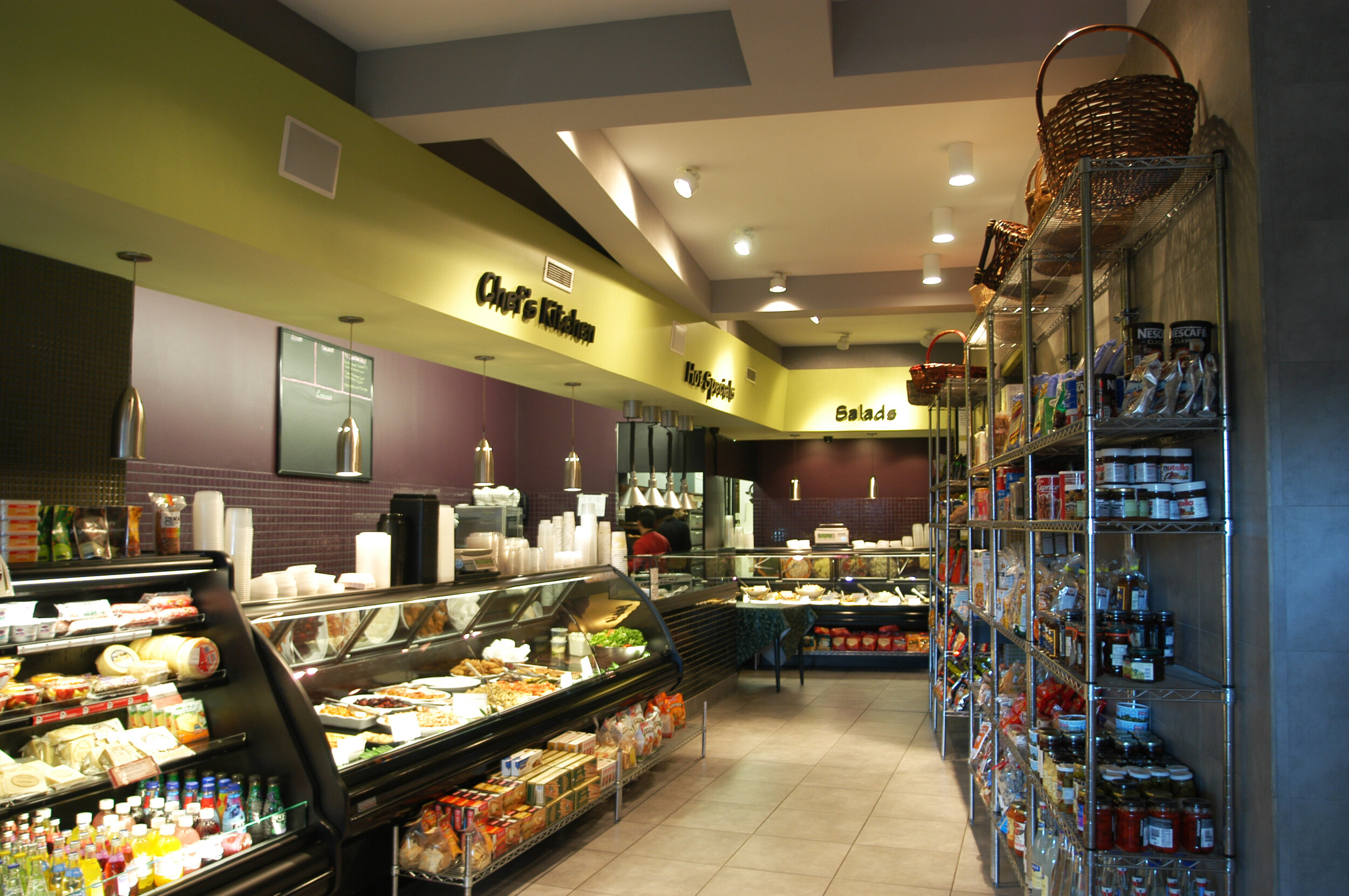
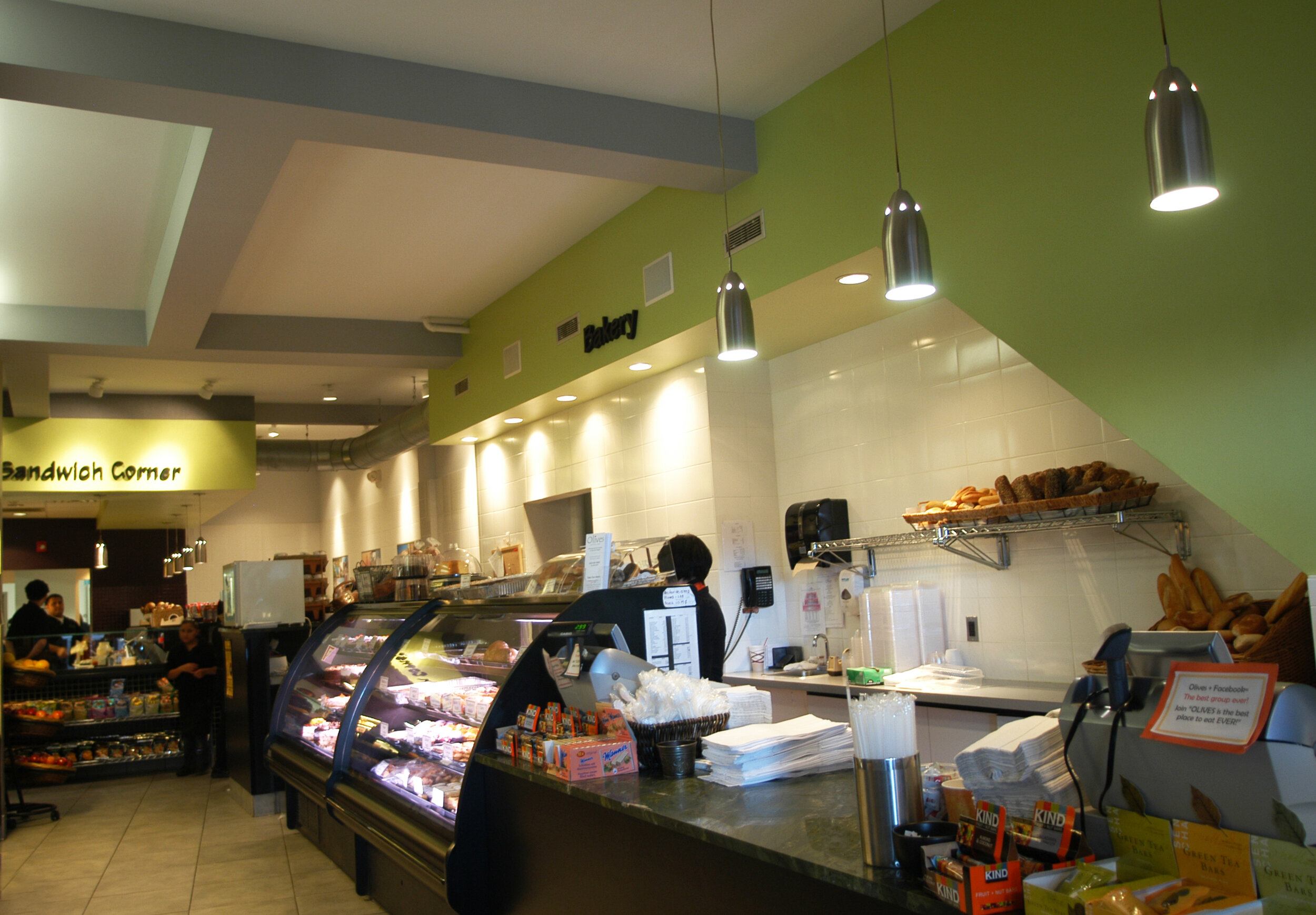
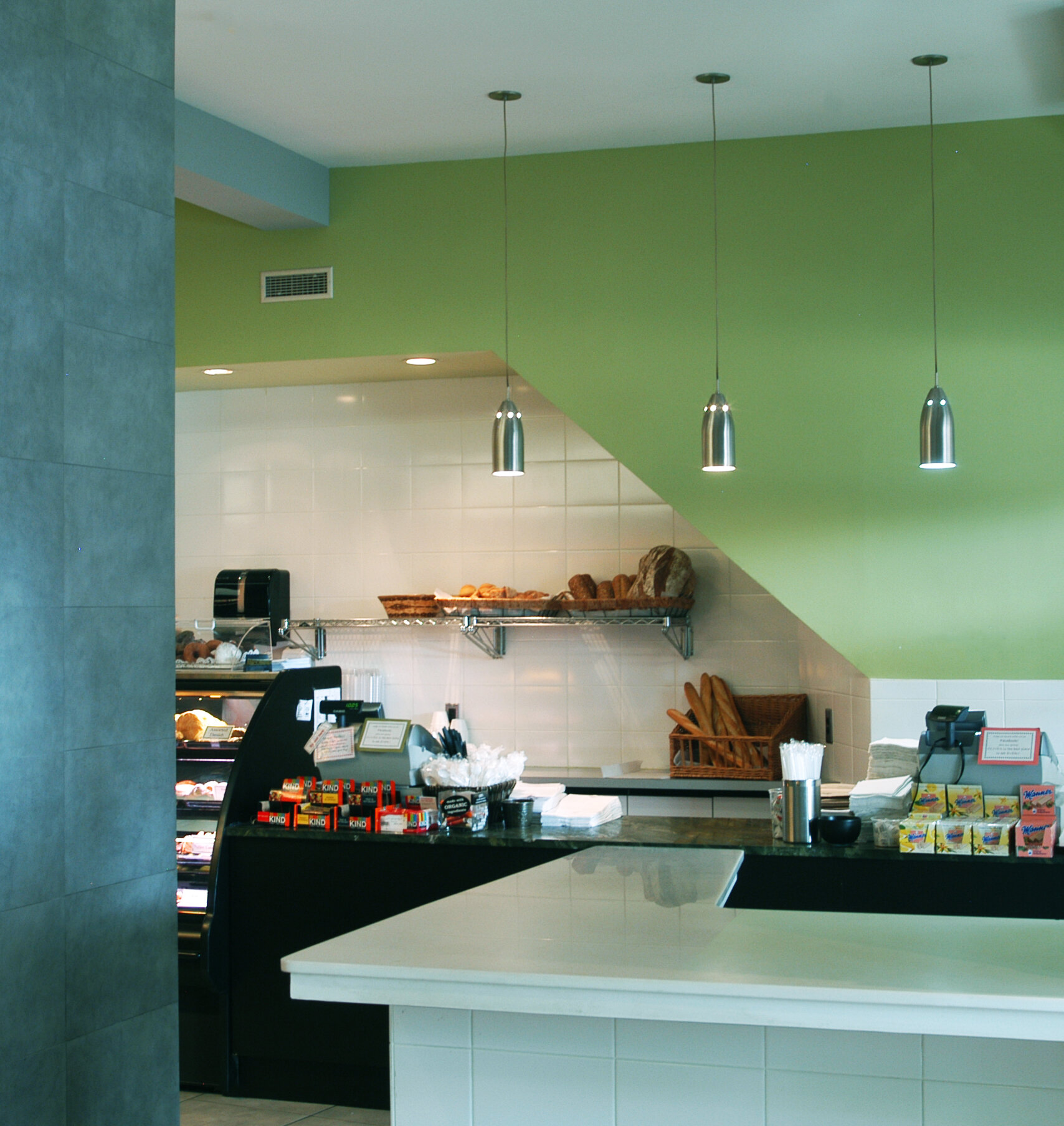
This project involved the design of a 3,300 square foot bakery and delicatessen in Princeton, NJ. The store originally occupied one half of its current site, but when the adjacent storefront became available, our clients decided to expand their business, by taking over the adjoining space. The criteria for the work was to unite the two spaces into a cohesive design and determine a logical progression for customers through the space. In a departure from our usual work, RSA was also asked to help “re-brand” the business by creating a recognizable image, new graphics and advertising.
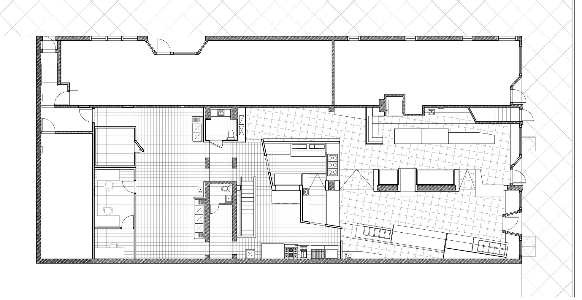
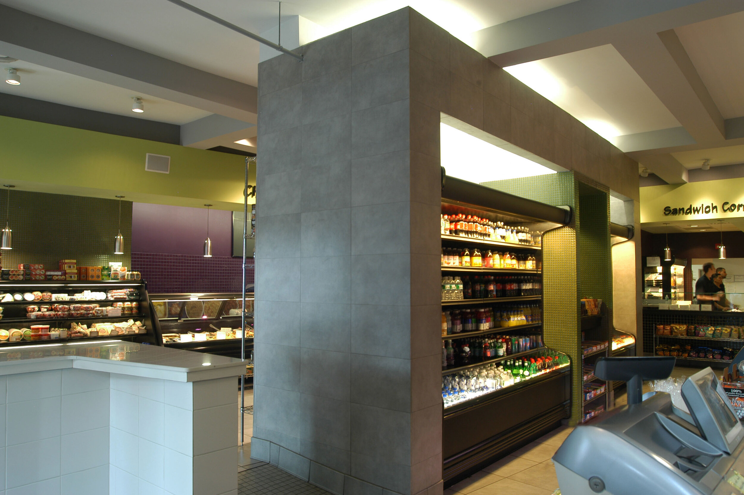
The primary architectural challenge in the design of the new space was the party wall that had once completely separated the two storefronts. A portion of the wall could be removed, but a significant amount needed to remain to ensure the structural integrity of the building. Moreover, the floors of the adjoining spaces were at different levels.
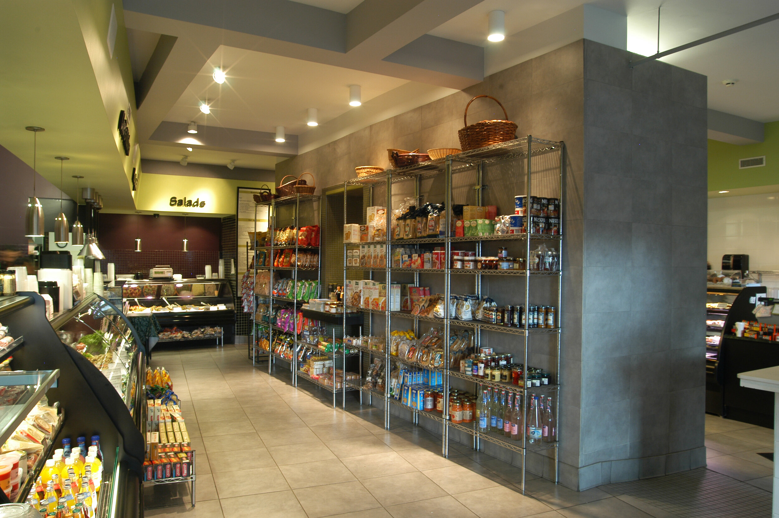
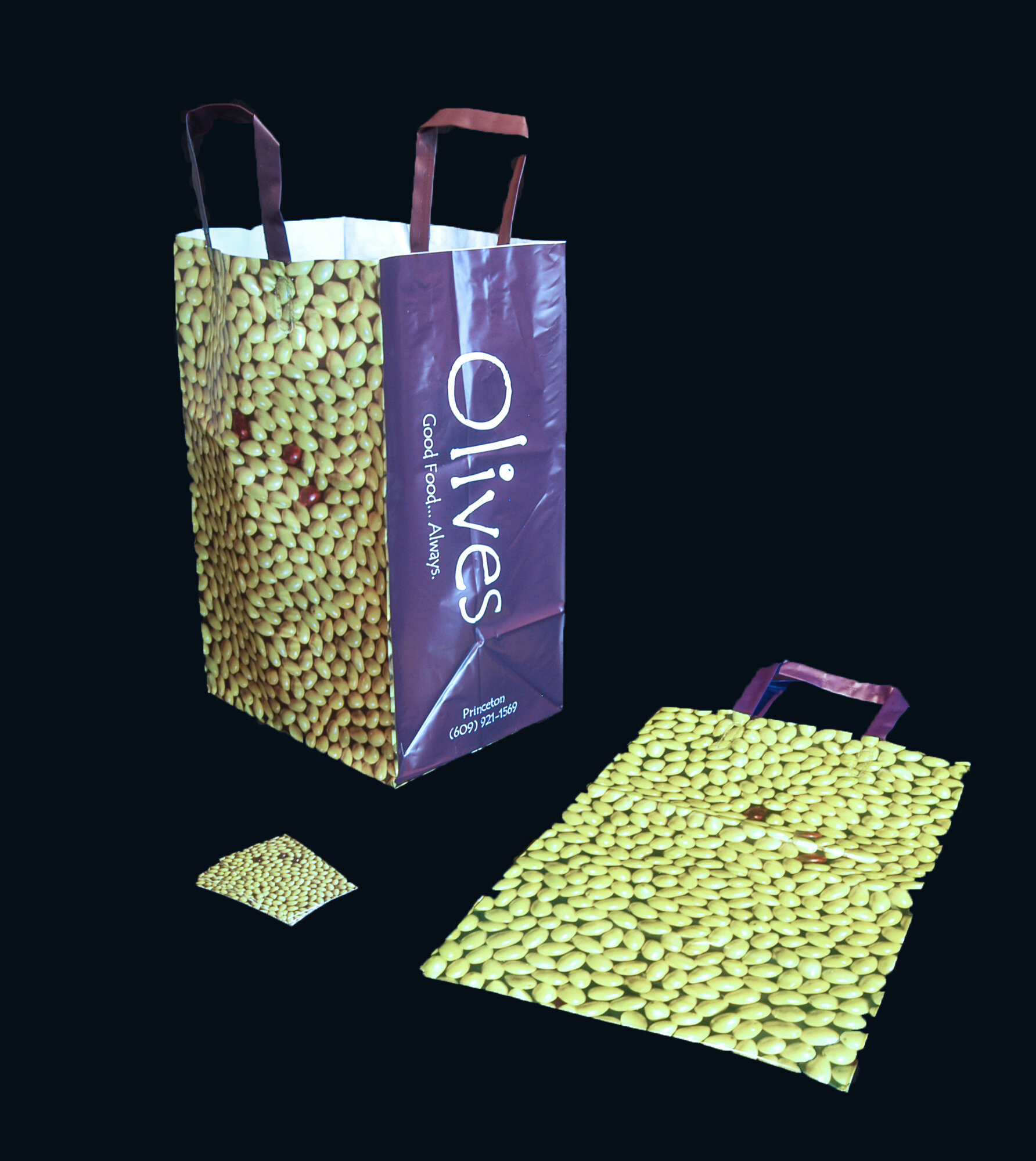
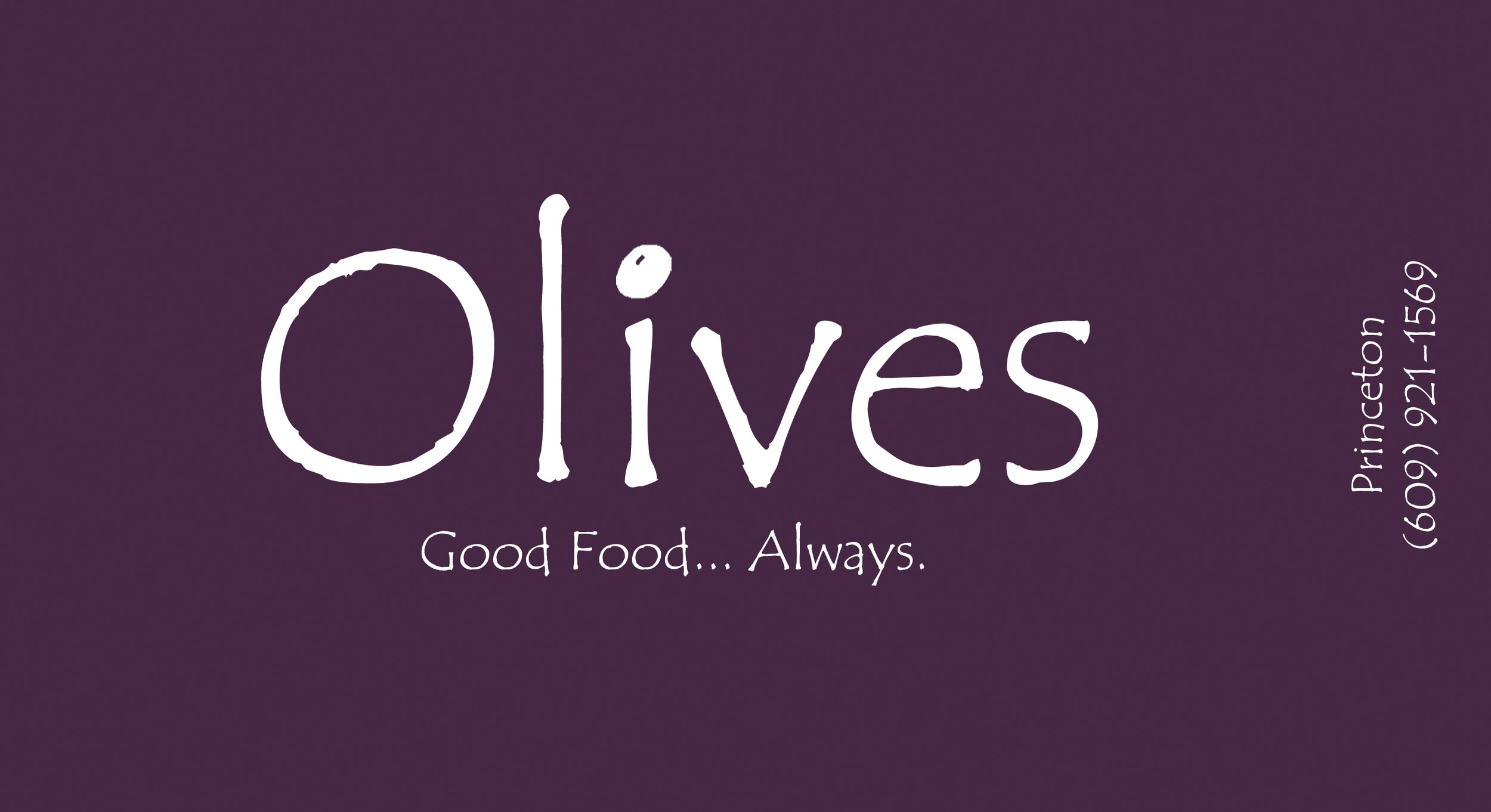
The design solution was to create a structural element at the center of the plan that contained the bearing walls, defined areas for ramps, and held merchandise for sale. The circulation route for the store would revolve around this new object from entry to exit. Along with the structural beams of the ceiling above, it was finished in a neutral concrete gray. In contrast, the edges of the space containing the food cases were developed in a bold “olive” color palette of purples and greens. Dropped soffits for signage, HVAC and lighting helped define the perimeter route. This color scheme also became the basis for the new graphic design. A field of green olives with three purple kalamata olives set within that represented the three owners was used for shopping bags and business card fronts. In addition, our office designed the typeface used for advertising, and created the “Good Food… Always” slogan.